September 14, 2025
Third Sip: Brewing Retro-Futurism into Every Cup
.png)
When Third Sip came to us, they had a bold vision: create a coffee brand that stood out in a crowded market. They wanted something playful, distinctive, and immersive—but their challenge was how to translate a loose retro-futuristic idea into a fully realized brand world that could extend across logo, interiors, packaging, and promotions without feeling gimmicky.
That’s where Lunary Studio stepped in.
Third Sip needed:
They had a vision of blending The Jetsons with mid-century modern optimism, but it needed structure and design rules to make it consistent.
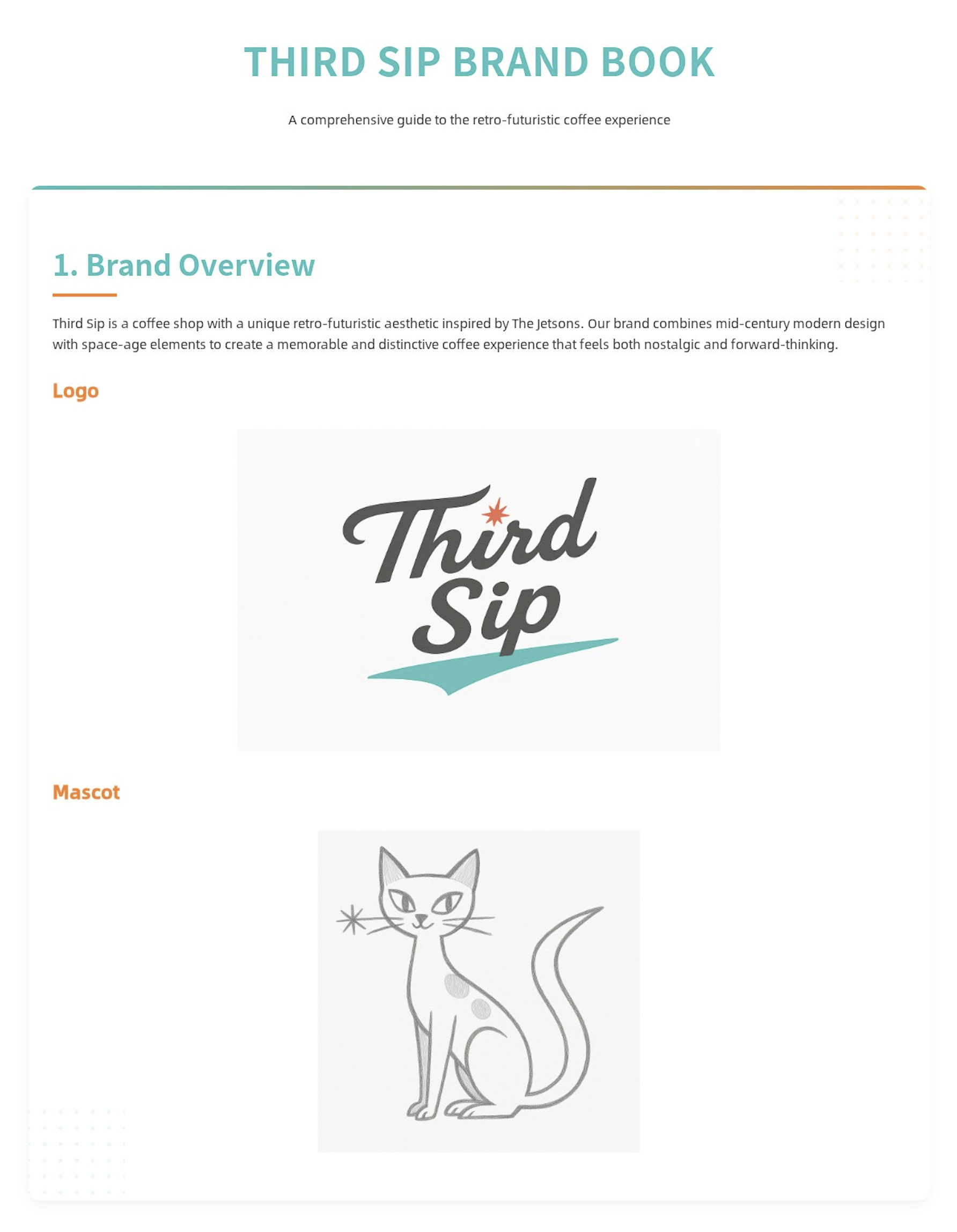

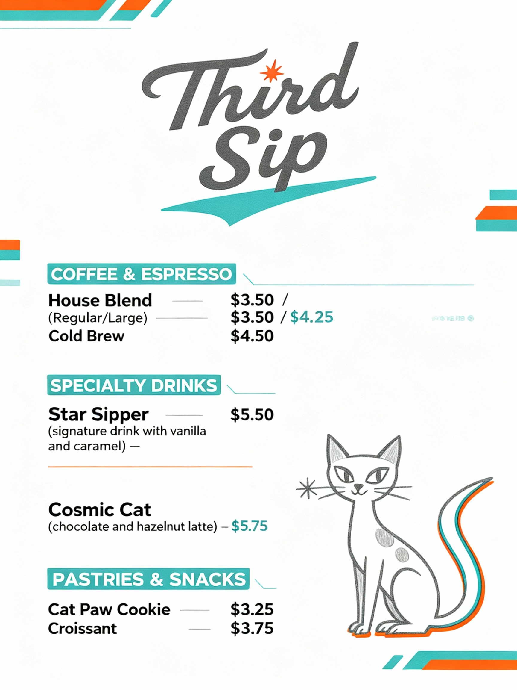
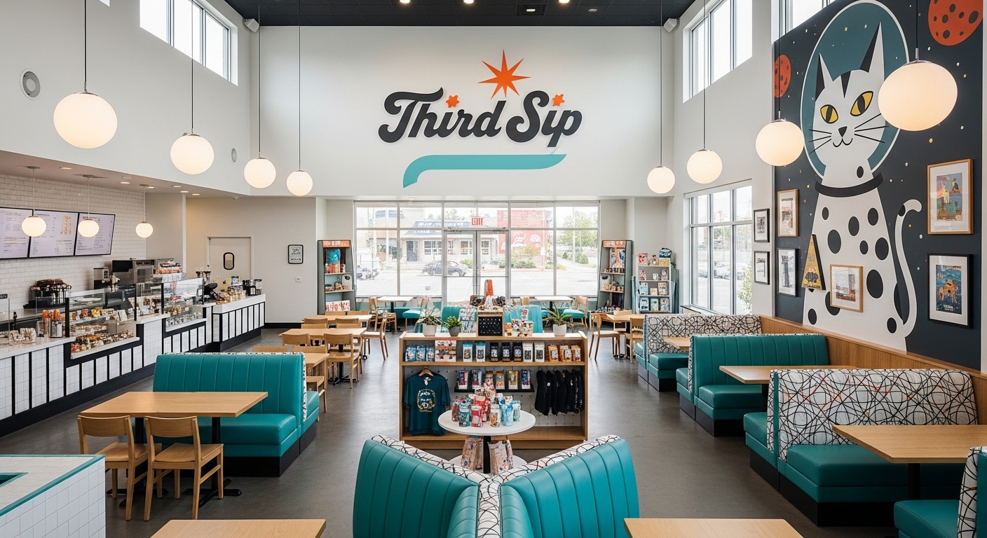
We crafted a script-style wordmark with an atomic starburst dotting the “i” in Third, anchored by a sweeping teal underline that feels like a rocket’s trail. The result: motion, optimism, and memorability.
We built a brand toolkit anchored in four key colors: Cosmic Teal, Atomic Orange, Space Gray, and Stellar White. This palette allows flexibility while ensuring instant recognition. Typography guidelines kept everything sleek and readable across applications.
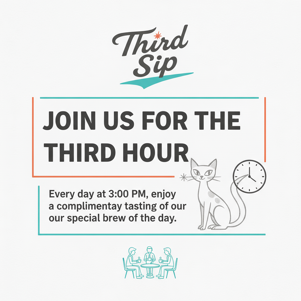
To avoid the brand feeling too corporate, we designed a cat mascot with almond-shaped eyes, circular spots, and a star accent. This character became a friendly, whimsical guide for customers—appearing on posters, menus, and even a full wall mural.
We extended branding into rituals and touchpoints:
Third Sip didn’t just get a logo—they got a world. The branding works seamlessly across:
By solving the initial problem—how to make a coffee brand feel immersive without losing clarity—we helped Third Sip establish itself as more than a café. It became a cultural experience.
✨ Takeaway for Our Studio: This project shows the power of holistic brand systems. When you design not just a logo, but a universe, you create emotional resonance and long-term loyalty.
.png)