Every font is a signal.
Every signal is a stance.
And in design, neutrality is a myth.
From fascist-adjacent fraktur to the sanitized friendliness of Google Sans, type is never just about “what looks good.” It’s about what it means—and who it’s been used by.
Fonts carry memory. Memory carries power.
So if you're picking type without knowing its politics, you might be cosplaying a regime without realizing it.
⸻
Typography Is a Class System
Let’s break this down:
- Serif fonts = tradition, trust, Ivy League, luxury, “serious.”
- Sans-serif fonts = modernity, accessibility, tech, “clean.”
- Blackletter/Gothic/Fraktur = medievalism, European nationalism, early 20th-century fascist propaganda.
- Rounded fonts = children’s media, Silicon Valley friendliness, or AI trying to seem non-threatening.
These associations aren’t random. They’re built from decades (centuries, really) of design history, propaganda, and mass reproduction. Fonts are part of the cultural scaffolding that tells us what to trust, what to fear, what to ignore.
⸻
Design Is Not Apolitical
The rise of brutalism in web design? A reaction to fake perfection.
The fetishization of Helvetica? A symptom of modernist worship.
The eerie comeback of blackletter in nationalist branding? Not a coincidence.
Ask yourself:
- Why does this font feel powerful?
- Who has used it before—and for what?
- What parts of society does this typeface exclude?
We don't ask this to gatekeep aesthetics. We ask because design creates belief systems, even if they’re subconscious.
⸻
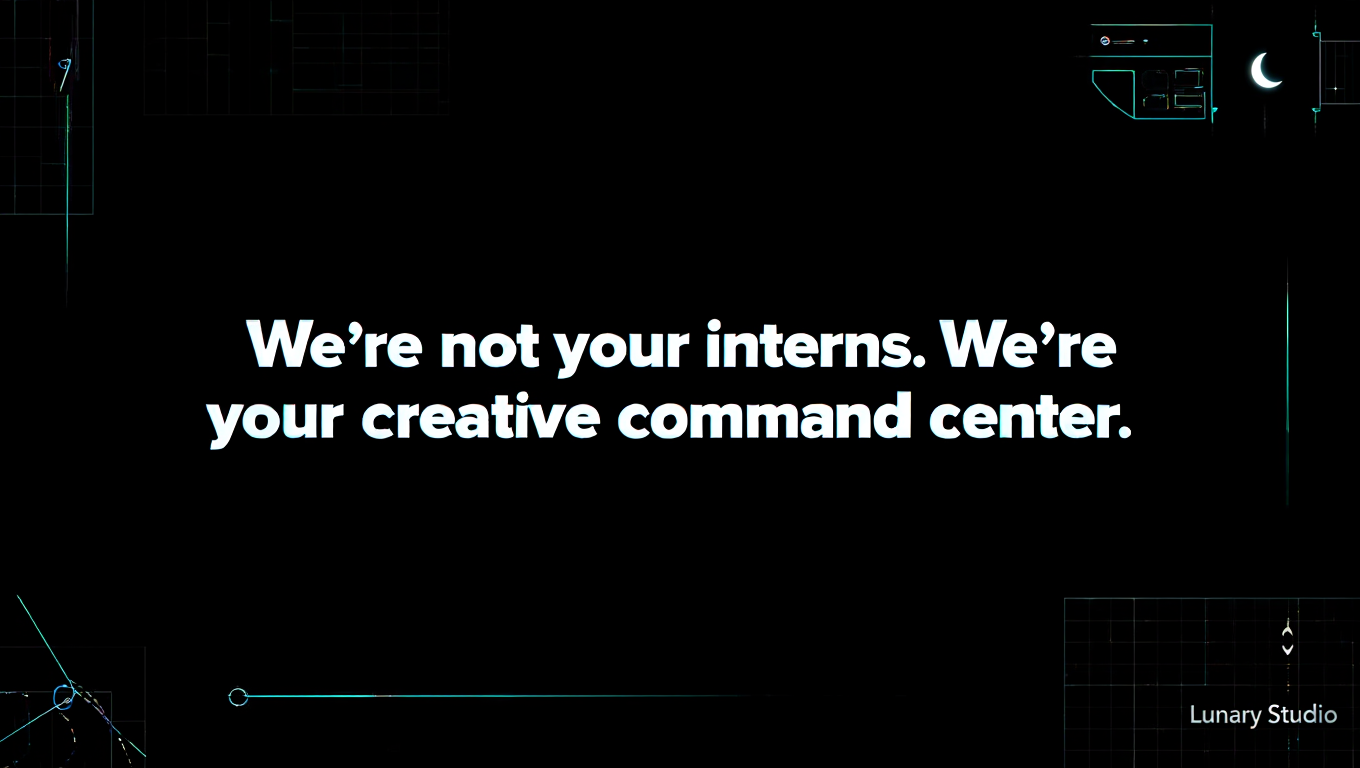
Choosing Fonts with Teeth
At Lunary, we don’t pick fonts just for vibes.
We pick fonts like we pick weapons: with context, precision, and care.
Sometimes that means using a serif to subvert tradition.
Sometimes it means letting a jagged, unreadable typeface speak the chaos of the moment.
Sometimes it means designing our own.
Whatever the case: if your words are radical but your font is corporate, something isn’t syncing.
⸻
🧠 Bonus: Fonts We Love (and Side-Eye)
- Love:
- ABC Diatype for clarity without blandness
- GT Super for ironic luxury
- Antique Olive for soft resistance
- Any font with weird ligatures and a broken past
- Side-eye:
- Futura (every founder’s first “clean” pick)
- Trajan (used for every war movie ever)
- Any typeface labeled “feminine” that looks like lipstick
⸻
Next Log: Rage Design — How to transmute protest, grief, and burnout into graphic form.